
This project was a real life project I worked on for the ADHD clinic I currently work at where I work a dual position of an Intake Coordinator and doing UX design work when needed.
The task given was to redesign the information architecture, content, and visual feel of the homepage of the office website with the hopes of being that it would result in an increase in sign ups by addressing obstacles at various checkpoints before the decision to sign up.
Ultimately, the goal was to reduce the friction users have between the time where they land on the company website to when they make the decision to fill out a new patient intake form.

The original layout of the website features a header, a full sized image slider in the hero section, followed by a small paragraph outlining the different cities the clinic serves with a schedule visit button. The following section showcases different services we provide with an icon representing each one with a small description of each. The following shows some testimonials for the site, followed by a contact us form, and finally a footer
Although I stressed the importance of getting solid user research, my manager was really opposed to "bothering" patients with doing interviews or surveys. In addition, no Google analytics was set up for the website which would make tracking progress tricky.
To substitute traditional methods of research, I decided to pool information from various areas that could clue me in to user pain points, markers of confusion, or just general improvements that could be made. These areas included looking at website reviews, customer emails, and pain points my manager had noticed. I looked at these multiple avenues over a 2 week period.
Due to me working a hybrid role as both UX designer and intake coordinator, I was able to gather insight from my role as intake coordinator and use that in my UX design work.
As an intake coordinator, I am the first point of contact prospective patients have. And as the first point of contact, I'm on the receiving end of the common questions and complaints patients have with onboarding.
This dual position proved to be helpful in gaining insight in a situation where traditional methods cant be used.
The first place I checked for insight was Google reviews to see if there were any complaints about the website performance and navigation.
The company has a 4.7 rating on Google so the majority were positive reviews. And the negative reviews were about not receiving phone calls back quick enough, high costs, and last minute appointment cancellations. Below are some examples.
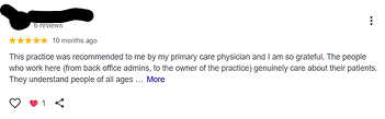
This feedback praised how great the doctors were and how helpful the staff was. None of the positive comments were about website at all so this wasnt that insightful.
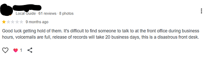
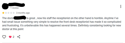
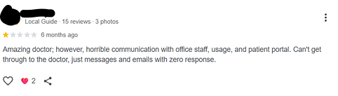
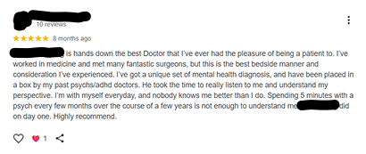
This feeback was primarily about having troubles gettingin contact with the office or experiences with the front desk receptionist. There were some frustrations mentioned about scheduling an appointment but it was about getting a phone call in rather than with the website specifically.
Based upon my website review search, I started wondering if maybe there were no complaints there, then perhaps nothing was wrong with the site.
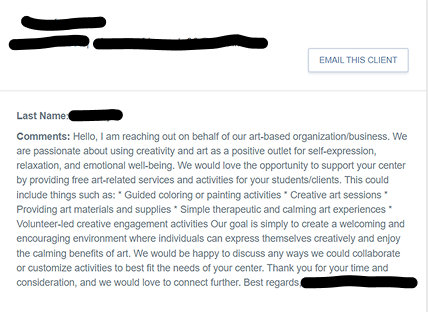
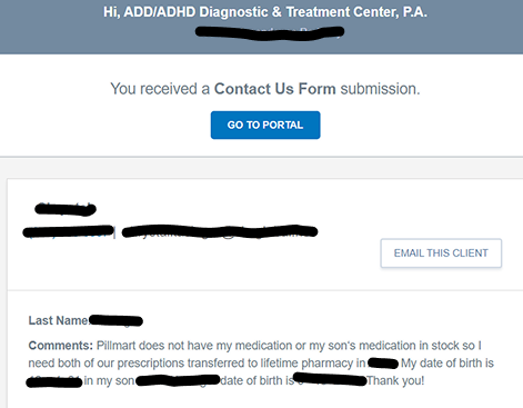
But next, I started on observing emails that we get in our inbox via the contact us form submission box located at the bottom of the website. and this showed a different story.
We had 25 submissions within a one month period and I observed 7 email types. Below are the the 7 categories of emails along with an example and the number of each inquiry type.
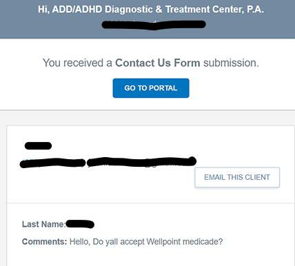
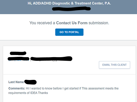
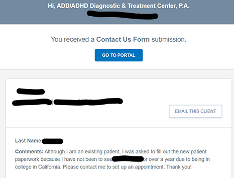
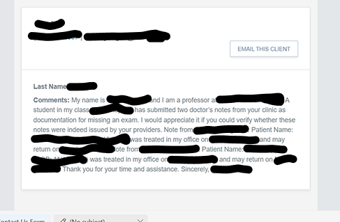
What I found interesting about this was that we got 12 scheduling inquiries which is about half of all the inquiries. And people are asking how to schedule in the inquiry box when the schedule button is in the upper half of the webiste far above the inquiry box. This means the there is an issue with either the appearance or positioning of the Call-to-action button and might also indicate that the contact us section may need to be removed from the home page all together.
Because I withheld a dual position in which I worked as also worked as an intake coordinator, I was able to hear common support questions or complaints that patients would often have. These are 2 themes that I could catch based upon phone calls.
Patients who would call in and tell me they were looking at out website and were interested would still ask what the process was to get scheduled even though there is a schedule button on the homepage
Patients who mentioned that they had been to our website would similarly ask what services we offered/ what was our process despite that being mentioned on the website as well.
Website was not informative enough on company values, services offered, and what to expect. This one of the most common questions people have even if they have already sifted through the site
The most common question we get in emails is how to schedule an appointmentUsers repeatadly would scroll past the schedule button to fill out the contact us form and proceed to ask how to get scheduled in the form. So, it wasnt clear how to set an appointment.
The main problem with the homepage was the current organization of information on the website was not landing people where they needed to be.
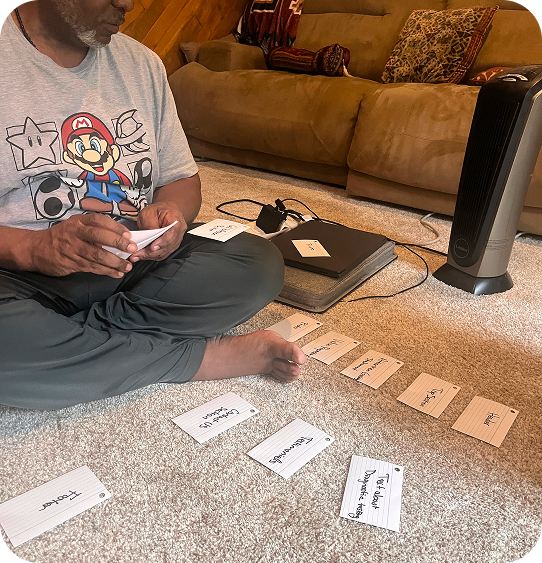
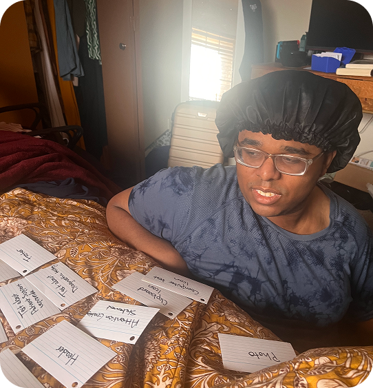
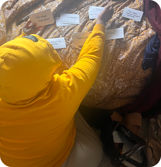
So, I conducted a card sorting exercise so I could understand how users would naturally categorize and organize information so that the website navigation would align with what users would expect.
Although I didnt test this on actual patients of the clinic, I did make sure all participants in the card sorting exercise also had ADHD so I could cater towards the specific audience of Neurodivergent thinkers. This way the thinking patterns mimic what clinic users might think.
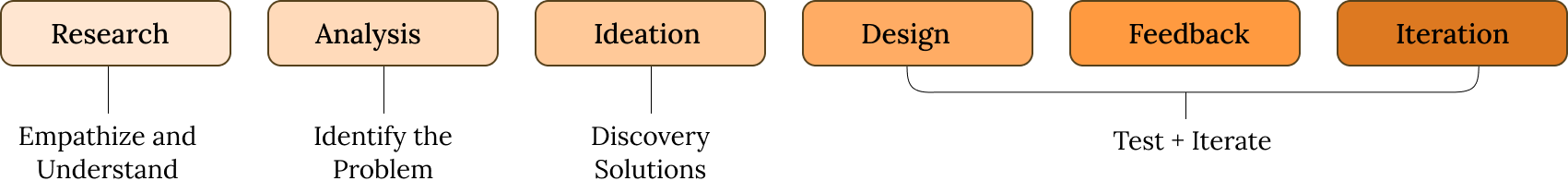
With research out of the way, I moved on to making my UX hypotheses so that I can frame my proposed solutions as testable predictions based upon research rather than random guessing.
we make the redesign the hero section of the website
we add in a value proposition section
the copy of the website is improved
we can increase sign ups.
we can reduce customer confusion about what we offer
increase user clarity
Now that I had a good idea of what felt intuitive for users, I made my sketches with those structures in mind.
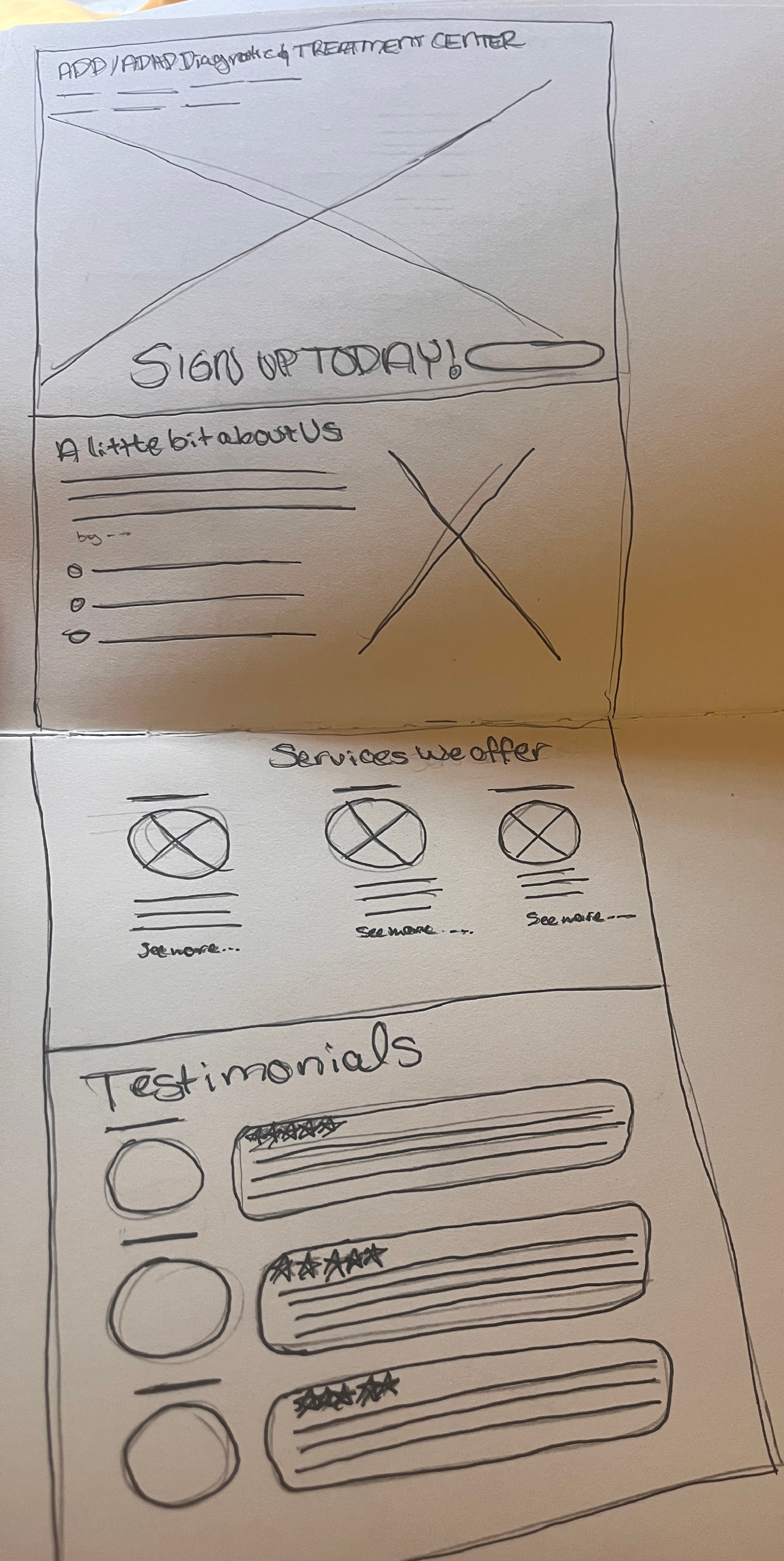
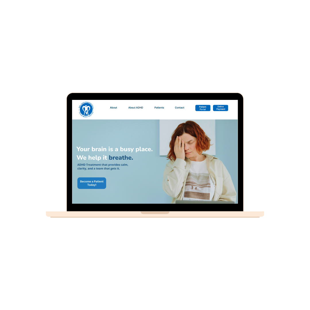
Based upon the card sorting exercise, sketch more closely aligned with the flow that would be more user friendly. So I made my first rendition of the home page.
.jpg)
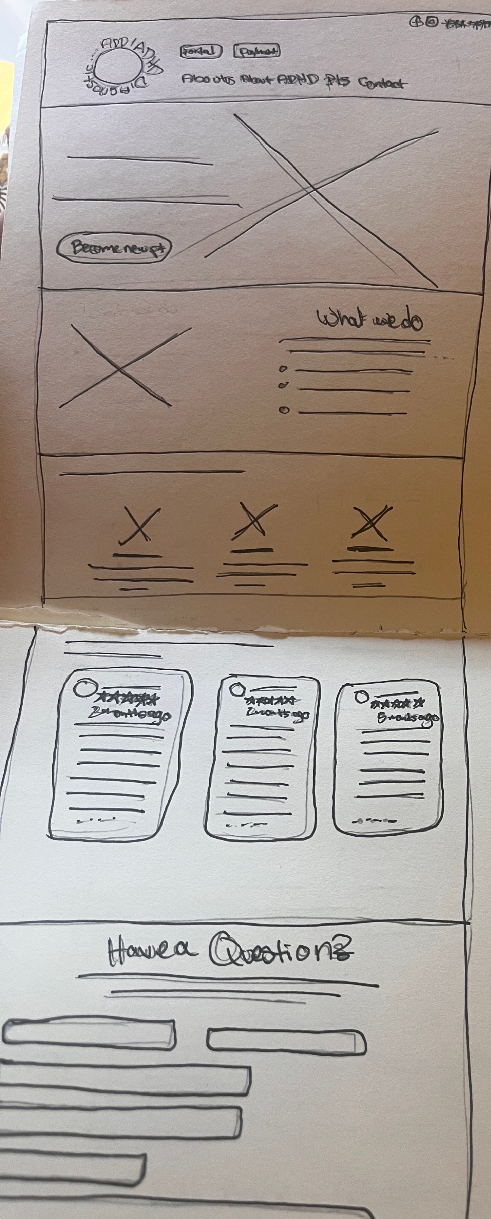
I shared my first iteration with my manager and she said she loved it but wanted to make a couple changes.
The first change was that she wanted the logo to stay in its original color.
The second change was that the wording of "holistic care" in the services section under diagnostic testing needed to be changed because of connotations of being affiliated with spiritual practitioners rather than evidence-based approaches.
The logo color change would mean I would have to incorporate that color in with the rest of the branding so I did that in my second iteration.
.jpg)
The second round of feedback was to play with the colors a little bit more because she didn't like the colors as much the 2nd time around.
In this last iteration, I played around with the color a little more trying to invoke a feeling of calm whole still having this more pronounced shade of blue that was in the logo as a part of the overall look.
.png)
Once I had finished the last iteration, there were some major changes at the clinic that resulted in the project getting put on hold.
One intake coordinator was let go and that led to my manager to making me a full time intake coordinator for a period of time and in addition to that, there was an unexpected passing from one of the doctors who was actually the husband of my manager.
Understandably, she didnt want to deal with anything related to work for a while. But with appropriate grieving time and slower pacing we have during the Summer, the project has recently been picked back up and designs are still being worked on.